By clicking "Accept all cookies", you agree to storing cookies on your device to enhance site navigation, analyze site usage and assist in our marketing efforts as outlined in our privacy policy.
By clicking 'Accept all cookies', you agree to storing cookies on your device to enhance site navigation, analyze site usage and assist in our marketing efforts as outlined in our privacy policy.
You've defined your positioning. You've crafted your messaging. You know who you are, who you're for, and why you matter.
Now comes the part everyone thinks is branding: the visual identity.
Logo. Colors. Typography. The elements that make your startup look like something. The assets that appear on your website, your pitch deck, your app icon, your business cards, your conference booth.
Visual identity is important. But it's fourth in the process, not first — because visuals without strategy are just decoration. A beautiful logo attached to unclear positioning is like a stunning facade on a building with no foundation.
"A charismatic brand includes a dedication to aesthetics. Why? Because it's the language of feeling, and in a society that's information-rich and time-poor, people value feeling more than information."— Marty Neumeier
The Brand Gap
Your visual identity creates feeling before your messaging creates understanding. People see your brand before they read your copy. That first visual impression shapes everything that follows — whether investors take your pitch seriously, whether prospects click through, whether candidates want to work for you.
This guide covers:
What a visual identity system includes
Logo development principles
Color system strategy
Typography selection
Supporting visual elements
Building a cohesive system
Brand guidelines documentation
Working with designers and agencies
Tools and resources
Let's make strategy visible.
What Visual Identity Includes
A complete visual identity system has multiple components that work together:
Core Elements
Logo: The primary visual mark. May include wordmark (logotype), symbol (logomark), or combination.
Color palette: Primary, secondary, and functional colors with defined usage.
Typography: Typeface selections for headlines, body text, and UI, with hierarchy rules.
Extended Elements
Iconography: Icon style and library for UI and communications.
Illustration: Illustration style if used, with guidelines for creation.
Photography: Photo direction including subject matter, composition, color treatment.
Motion: Animation principles, transitions, and motion language.
Digital applications: Website, app, social media, email, presentations.
Print applications: Business cards, letterhead, brochures, signage.
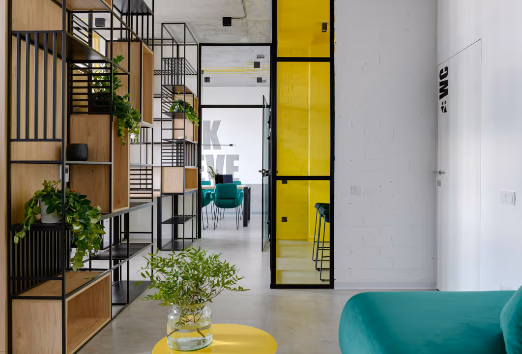
Environmental: Office space, trade show booths, merchandise.
The scope depends on your stage and needs. A seed startup might need only logo, colors, and typography. A Series B company preparing for scale needs the complete system.
Branding vs Logo by Metabrand
Logo Development
The logo is the most visible brand element — the signature that appears everywhere. But it's also the most overemphasized. A mediocre logo with strong strategy outperforms a beautiful logo with no strategic foundation.
That said, your logo matters. Here's how to get it right.
What a Logo Must Do
Identify: The logo's primary job is identification, not description. It doesn't need to explain what you do. Apple's logo doesn't show computers. Nike's swoosh doesn't show shoes. The logo identifies the brand; other elements explain it.
Scale: Work at every size — from 16px favicon to conference backdrop. Logos that depend on fine detail break at small sizes. Logos that are too simple feel empty at large sizes.
Adapt: Function across contexts — light backgrounds, dark backgrounds, color and monochrome, digital and print, horizontal and vertical orientations.
Endure: Resist trends that date quickly. The best logos last decades with minimal modification. Trend-forward logos require constant updating.
Logo Types
Wordmark (Logotype): The company name styled as the logo.
Best for: Companies wanting heritage or traditional associations. Rarely right for tech startups.
Logo Design Principles
Simplicity: The best logos are simple enough to sketch from memory. Complexity breaks at small sizes and fights for attention. When in doubt, simplify.
Rob Janoff, designer of the Apple logo, made it distinctive with one element: the bite. That single detail creates recognition without complexity.
Distinctiveness: Your logo should be identifiable as yours, not mistakable for competitors. In a sea of blue SaaS logos with abstract geometric marks, a different approach differentiates.
Study your competitive landscape. If everyone uses circles, consider squares. If everyone is minimal, consider more character. If everyone is playful, consider restraint.
Timelessness: Avoid trends that will date the logo. Gradients, shadows, extreme effects — these signal "designed in [year]." The logos that last share a certain restraint.
Look at logos that have survived decades: Nike (1971), Apple (1977), FedEx (1994). They're simple, distinctive, and largely unchanged.
Versatility: Design for the toughest constraints first. If it works as a 16px favicon, it'll work everywhere. If it works in black and white, it'll work in color.
Create multiple versions:
Full color
Single color (black, white, brand color)
Light background / dark background
Horizontal / stacked orientations
With and without tagline
Relevance: The logo should feel appropriate for your category and audience. An enterprise security company needs a different tone than a consumer social app. A fintech startup needs a different feel than a gaming studio.
Relevance doesn't mean literal representation. Apple doesn't show computers. Amazon doesn't show books or packages. But both logos feel appropriate for their brands.
The Logo Development Process
1. Strategic brief
Before any design, document:
Positioning and brand platform
Target audience and their expectations
Competitive visual landscape
Required applications (where will logo appear?)
Mandatory constraints (existing equity to preserve?)
2. Research and inspiration
Audit competitive logos
Collect visual inspiration (not for imitation — for understanding)
Identify category conventions and opportunities to break them
Explore different types (wordmark, symbol, combination)
Don't refine too early — breadth before depth
4. Direction selection
Present 3-5 distinct directions
Evaluate against strategic criteria
Select 1-2 directions for refinement
5. Refinement
Iterate on selected direction(s)
Test at multiple sizes
Develop variations (color, orientation)
Stress test in applications
6. Finalization
Final artwork in all required formats
Usage guidelines
Asset package (vector files, PNG exports at various sizes)
Timeline: 4-8 weeks for comprehensive logo development, depending on complexity and decision speed.
Color System
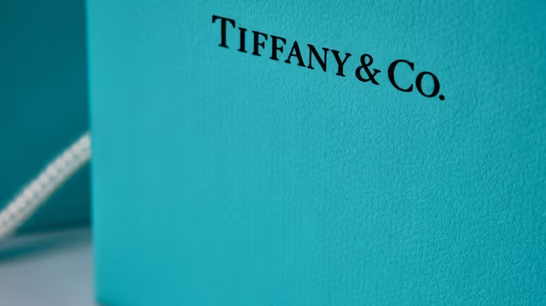
Tiffany Blue
Color is the most immediately impactful visual element. People recognize brands by color before they read logos or names. Tiffany blue, Coca-Cola red, UPS brown — these colors are brand assets worth billions.
Color Psychology (and Its Limits)
Color carries associations:
Blue: Trust, stability, professionalism. Overused in fintech and enterprise software for this reason.
Red: Energy, urgency, passion. Attention-getting but can signal danger.
Green: Growth, nature, health. Common in sustainability and wellness.
Yellow: Optimism, creativity, caution. High visibility but hard to use as primary.
Purple: Luxury, creativity, imagination. Less common, distinctive.
Orange: Enthusiasm, confidence, affordability. Friendly but can feel cheap.
White: Purity, simplicity, cleanliness. Modern tech aesthetic.
But color psychology has limits. Context matters more than inherent meaning. IBM's blue means "enterprise." Facebook's blue means "social." Same color, different associations built through use.
Don't choose colors based solely on psychology. Choose based on:
Strategic fit with positioning
Differentiation from competitors
Practical usability across applications
Audience expectations and cultural context
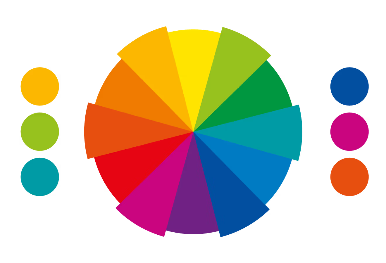
Building a Color Palette
Primary colors: 1-3 colors that define your brand. These do the heavy lifting. Most brands have one dominant primary color.
Secondary colors: Supporting colors for variety and hierarchy. Extend the primary palette without overwhelming it.
Functional colors: UI-specific colors for success (green), error (red), warning (yellow), information (blue). These serve usability, not brand expression.
Neutral colors: Grays, off-whites, off-blacks for text, backgrounds, and UI elements.
Color System Structure
Color Wheel byMetabrand
A complete color system defines:
Color values: Exact specifications in multiple formats:
Hex (#0066FF)
RGB (0, 102, 255)
CMYK (100, 60, 0, 0) for print
Pantone (if brand consistency in print is critical)
HSL/HSB for design tools
Color relationships: How colors are used together:
Primary on white background
Primary on dark background
Secondary color usage
Color combinations to use
Color combinations to avoid
Usage ratios: Proportions for color balance:
60% dominant (often neutral/white)
30% secondary (primary brand color)
10% accent (secondary or contrasting)
Accessibility requirements: Contrast ratios for text:
WCAG AA: 4.5:1 for normal text, 3:1 for large text
WCAG AAA: 7:1 for normal text, 4.5:1 for large text
Digital screens: Colors appear differently across monitors, devices, and browsers. Test on multiple screens.
Print: CMYK printing can't reproduce all RGB colors. Some vibrant screen colors print dull. Get print proofs before committing.
Environment: Consider where colors will appear — office walls, trade show booths, merchandise. Some colors that work on screen fail in physical space.
Cultural context: Colors carry different meanings across cultures. White is purity in Western contexts, mourning in some Eastern contexts. Red is luck in China, danger in Western contexts. Screen for target markets.
Competitive Differentiation Through Color
If your category has established color conventions, you have two strategies:
Conform: Use expected colors to signal category membership. Most fintech uses blue because customers expect financial services to look trustworthy.
Contrast: Break conventions to stand out. Monzo's hot coral pink differentiated them in a sea of blue banks. Risky but memorable.
Audit your competitive landscape. Map competitor colors. Identify white space. Decide whether conformity or contrast serves your positioning better.
Typography
Typography shapes how your brand feels when read. The typefaces you choose communicate personality before anyone processes the words.
Type Terminology
Typeface vs. Font: A typeface is the design (Helvetica). A font is a specific instance (Helvetica Bold 12pt). In practice, these terms are often used interchangeably.
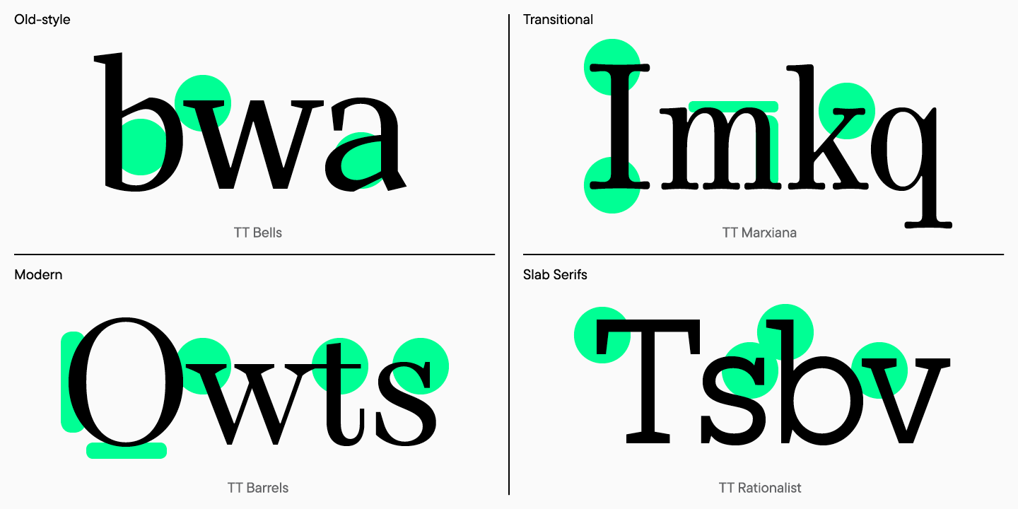
Serif: Typefaces with small decorative strokes (serifs) at letter ends. Times New Roman, Georgia, Garamond. Traditional, authoritative, readable in print.
Sans-serif: Typefaces without serifs. Helvetica, Arial, Inter. Modern, clean, screen-optimized.
Weight: Thickness of strokes. Light, Regular, Medium, Semibold, Bold, Black. More weights = more flexibility.
Width: Letterform width. Condensed, Normal, Extended. Affects how much text fits in a space.
Style: Roman (upright) vs. Italic (slanted). Italics for emphasis, not primary use.
Selecting Typefaces
Primary typeface: The workhorse for most applications — headlines, body copy, UI. Requirements:
Highly legible at all sizes
Multiple weights available
Web font available
Appropriate personality
Secondary typeface: For contrast and hierarchy. Might pair:
Display typeface: Optional. For headlines and special applications only. Can be more distinctive/expressive since it's used sparingly.
Type Pairing Principles
Contrast: Pair typefaces that are different enough to create visual interest. Two similar sans-serifs fight each other. A geometric sans and an elegant serif create productive tension.
Compatibility: Despite contrast, pairs should feel harmonious. Similar x-heights, similar proportions, complementary personalities.
Hierarchy: Use type contrast to establish hierarchy. Serif headlines with sans-serif body, or bold sans headlines with regular weight body.
Restraint: Two typefaces are usually enough. Three maximum. More creates chaos.
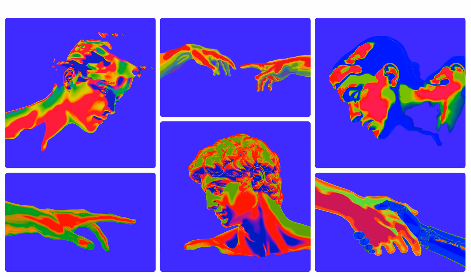
Illustration adds personality and explains concepts that photography can't. But illustration style varies enormously — defining it clearly is essential.
Illustration style dimensions:
Realistic vs. abstract: Realistic shows specific scenarios. Abstract conveys concepts.
Detailed vs. minimal: Detailed illustrations are rich but expensive. Minimal illustrations scale better.
Human figures: If people appear, define their style, diversity representation, and context.
Color approach: Full brand palette or limited palette? Flat or gradient?
Outline vs. filled: Relates to overall brand weight and icon style.
When to use illustration:
Explaining complex concepts
Empty states in product
Marketing storytelling
Differentiation from photo-heavy competitors
Creating illustration guidelines:
Reference examples showing approved style
Color specifications
Do's and don'ts
Process for commissioning new illustrations
Photography
Photography direction ensures visual consistency when using photos in marketing, website, and communications.
Photography style dimensions:
Subject matter: People, products, environments, abstract. What do you show?
Composition: Centered vs. rule-of-thirds, tight crops vs. context, negative space usage.
Lighting: Natural vs. studio, bright vs. moody, high-key vs. low-key.
Color treatment: Saturated vs. muted, warm vs. cool, brand color overlay.
People portrayal: Posed vs. candid, individual vs. groups, professional vs. casual, diversity representation.
Photo sourcing:
Custom photography: Most distinctive, most expensive. Full control.
Shared DNA: Elements should share underlying characteristics. If your logo uses rounded corners, icons should too. If your typography is geometric, other elements should feel geometric.
Consistent ratios: Use consistent proportions — spacing, sizing, grid. A base unit (8px is common) creates mathematical relationships across the system.
Color harmony: All elements should use the same color palette. Icons, illustrations, photography treatment — same colors create cohesion.
Personality alignment: Every element should express the same brand personality. If you're "friendly and approachable," your typography, illustration, and photography should all feel friendly and approachable.
The Grid System
A grid system creates consistent spatial relationships:
Base unit: The atomic spacing unit. 4px or 8px are common. All spacing is a multiple of this unit.
Spacing scale: Defined increments. Example with 8px base:
xs: 8px
sm: 16px
md: 24px
lg: 32px
xl: 48px
xxl: 64px
Layout grid: Column grid for layouts. 12-column is standard for web (flexible division by 2, 3, 4, 6).
Component spacing: Consistent internal spacing within components (padding, margins between elements).
Creating Visual Harmony
Element relationships:
Map how elements relate:
Logo → uses primary typeface (or complements it)
Icons → match logo line weight and corner radius
Illustration → uses brand color palette
Photography → treated with brand color overlay or filter
UI → uses type scale and spacing scale
Testing cohesion:
Create sample applications that combine elements:
Homepage mock with logo, type, photos, icons together
Presentation deck with charts, icons, text
Social media post combining illustration and typography
Does it feel unified? Can you tell it's all the same brand?
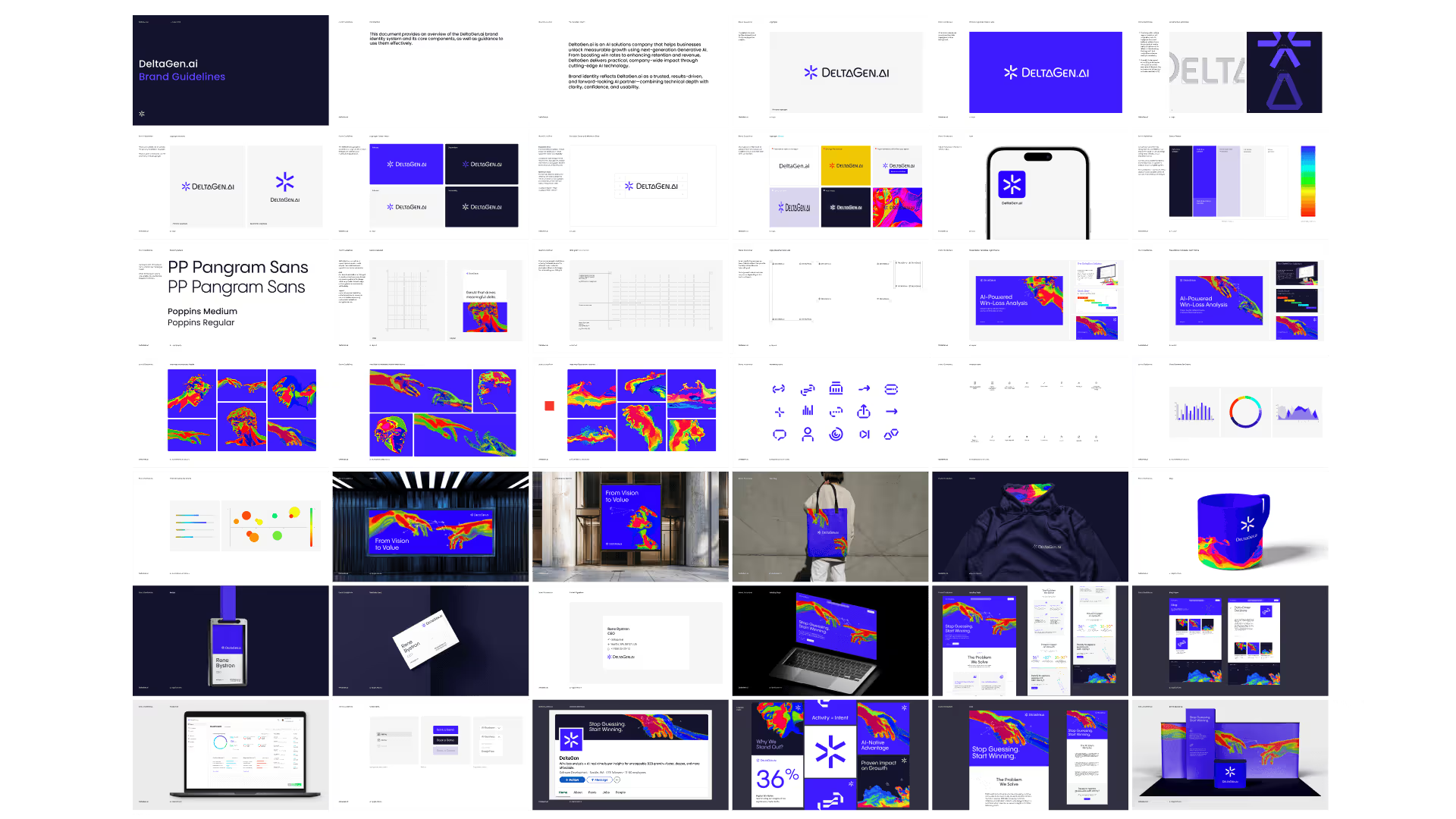
Brand Guidelines Documentation
A visual identity exists in documentation. Without guidelines, the system fragments through inconsistent execution.
What Guidelines Include
Core identity:
Logo files and usage rules
Clear space and minimum size
Incorrect usage examples
Color palette with values
Typography system
Extended identity:
Iconography guidelines
Illustration style guide
Photography direction
Motion principles
Applications:
Digital templates (website, social, email)
Print templates (business cards, letterhead)
Presentation templates
Environmental/signage guidelines
Resources:
Asset downloads (logo files, fonts, templates)
Contact for questions
Guidelines Formats
PDF guidelines: Traditional format. Good for distribution but hard to update. Use for stable, mature brands.
Digital/web guidelines: Living documentation that can be updated. Tools:
Design tool libraries: Figma libraries, Sketch libraries for direct designer use. Include:
Logo components
Color styles
Type styles
Icon library
Component library
Guidelines Best Practices
Show, don't just tell: Examples are clearer than rules. Show correct usage, show incorrect usage, show why.
Prioritize what matters: Not all rules are equal. Distinguish mandatory from recommended from flexible.
Make assets accessible: Guidelines without downloadable assets are useless. Include everything teams need.
Keep it current: Outdated guidelines cause confusion. Review quarterly, update as system evolves.
Train users: Guidelines alone aren't enough. Walk teams through the system. Answer questions. Create feedback channels.
Working with Design Partners
Most startups work with external designers or agencies for visual identity. Here's how to set up for success.
What to Look for in Design Partners
Portfolio quality: Do you admire their work? Is it distinctive? Does any of it feel relevant to your category/stage?
Strategic thinking: Do they explain why they made decisions, or just show pretty pictures? Visual identity should express strategy, not just aesthetic preference.
Process clarity: Can they explain how they work? What's the timeline? What input do they need? What do deliverables include?
System thinking: Do they deliver complete systems, or just individual pieces? A logo without guidelines and applications is incomplete.
Communication style: Are they responsive? Clear? Do they push back constructively or just say yes?
Visual inspiration (with explanation of what you like about each)
Personality attributes to express
What to avoid
Existing assets to preserve or evolve
Process:
Decision-makers and approval process
Stakeholders to involve
Communication preferences
Feedback expectations
Evaluating Design Work
When reviewing concepts:
Evaluate against strategy, not personal taste. Does this express our positioning? Does it appeal to our target audience? Not just "do I like it?"
Give it time. First reactions aren't always right. Live with concepts before deciding. Your initial discomfort might be distinctiveness.
Test at scale. See it in application — on a website mock, at business card size, as an app icon. Context reveals strengths and weaknesses.
Provide actionable feedback. "I don't like it" doesn't help. "This feels too playful for our enterprise audience because..." helps.
Trust expertise. Designers see things you don't. If they push back on feedback, listen to why. They've done this before.
Separate rounds. Feedback on direction first. Refinement feedback later. Don't mix strategic and executional feedback.
Visual Identity Checklist
Before finalizing your visual identity, verify:
Logo
☐ Works at all sizes (favicon to banner) ☐ Works in color, black, white, reversed ☐ Clear space defined ☐ Variations for different contexts exist ☐ Files available in all formats (SVG, PNG, PDF)
Colors
☐ Primary palette defined (1-3 colors) ☐ Secondary palette defined ☐ Functional colors defined (success, error, warning) ☐ All color values documented (Hex, RGB, CMYK) ☐ Accessibility verified (contrast ratios) ☐ Usage guidelines clear
Typography
☐ Primary typeface selected and licensed ☐ Secondary typeface (if needed) selected ☐ Type scale defined (sizes, weights, line heights) ☐ Web font implementation tested☐ Fallback fonts specified
Extended Elements
☐ Icon style defined (or library selected) ☐ Illustration style defined (if using) ☐ Photography direction documented ☐ Motion principles outlined (if relevant)
System Cohesion
☐ Elements work together harmoniously ☐ Spacing/grid system defined ☐ Tested across multiple applications ☐ Personality is consistent throughout
Documentation
☐ Brand guidelines complete ☐ Asset library organized and accessible ☐ Templates created for key applications ☐ Team trained on system
Visual Identity Resources
Design Tools
Figma — Industry standard for brand and UI design. Collaborative, browser-based.
Built to last: Avoids trends, designed for the long term.
A startup's visual identity will be seen millions of times over the company's life — on screens, in presentations, on products, in minds. That investment in quality pays dividends every time someone encounters your brand.
Make it count.
Frequently Asked Questions
What's included in a visual identity system?
A complete visual identity system includes: logo (with variations for different contexts), color palette (primary, secondary, and functional colors), typography (typefaces, hierarchy, and usage rules), and supporting elements like iconography, illustration style, photography direction, and graphic patterns. For digital products, it also includes UI-specific elements. All of this is documented in brand guidelines that specify how to use each element correctly. The goal is a cohesive system that works across every touchpoint, not just a logo.
How do I choose colors for my startup's brand?
Start with strategy, not preference. Consider your positioning, audience, and competitive landscape. What do competitors use? (Differentiation opportunity or category convention to follow?) What emotional associations fit your brand personality? (Blue for trust, green for growth, purple for creativity, black for sophistication.) Ensure accessibility — your colors need sufficient contrast for readability. Build a system: 1-3 primary colors, secondary colors for variety, and functional colors for UI states. Test across applications before finalizing.
When should a startup invest in custom illustration or photography?
Custom illustration or photography makes sense when: stock imagery can't capture your specific audience or use case, your brand personality requires a distinctive visual voice, you're at a stage where differentiation justifies the investment, or you need imagery at a volume where custom becomes more economical than licensing. Most seed-stage startups can defer custom imagery. By Series A, when brand becomes a growth lever, custom visual assets help differentiate. The key is consistency — better to have fewer custom assets used consistently than a mix of styles.
Build Your Visual Identity
If you're ready to develop a visual identity for your startup — or feeling that your current identity isn't working — we can help.
Metabrand creates visual identity systems for tech startups, from strategic foundation through comprehensive guidelines. We design identities that express your positioning, differentiate from competitors, and scale with your growth.


