By clicking "Accept all cookies", you agree to storing cookies on your device to enhance site navigation, analyze site usage and assist in our marketing efforts as outlined in our privacy policy.
By clicking 'Accept all cookies', you agree to storing cookies on your device to enhance site navigation, analyze site usage and assist in our marketing efforts as outlined in our privacy policy.
You've invested in brand strategy. You've developed positioning, messaging, visual identity. Everything looks great.
Then reality sets in.
The sales team creates a deck with the wrong logo. Marketing uses colors that aren't in the palette. A new hire writes website copy in a completely different tone. The engineering team picks a random font for the product UI. Your investor update uses a logo someone pulled from Google Images — stretched and pixelated.
Six months later, your brand is fragmented. The consistency you worked to create has dissolved into chaos. Every touchpoint feels slightly different. Customers sense something is off, even if they can't articulate what.
This is what happens without brand guidelines.
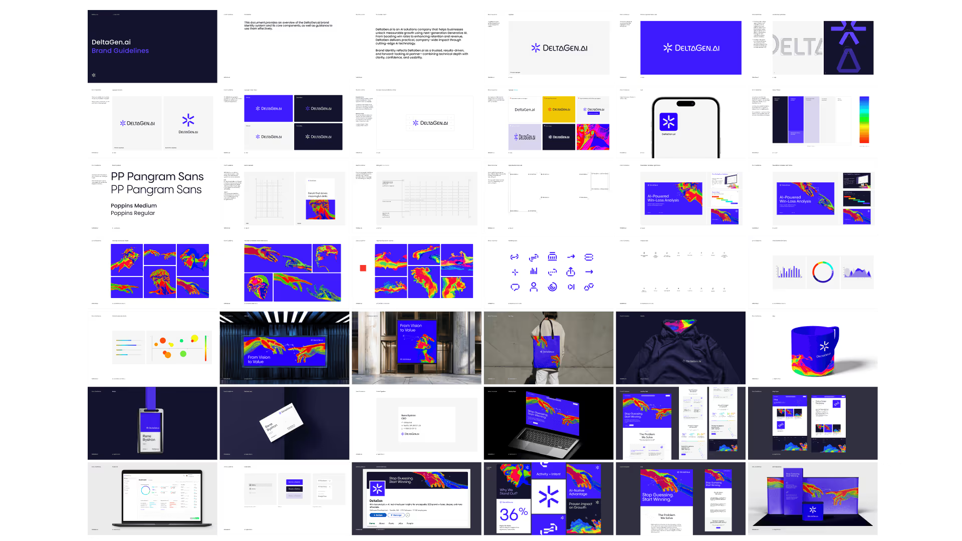
Brand guidelines are the documentation that ensures everyone — internal teams, external partners, agencies, freelancers — executes the brand consistently. They're the bridge between brand strategy and brand execution.
A complete brand guideline document covers both strategic foundation and tactical execution.
Strategic Foundation
Brand Overview
Company story and mission
Brand purpose and vision
Target audience summary
Positioning statement
Brand values
This section ensures anyone using the guidelines understands why the brand exists and who it's for. Tactical rules make more sense when grounded in strategy.
Brand Personality
Personality attributes (3-5 adjectives)
Tone of voice description
Communication principles
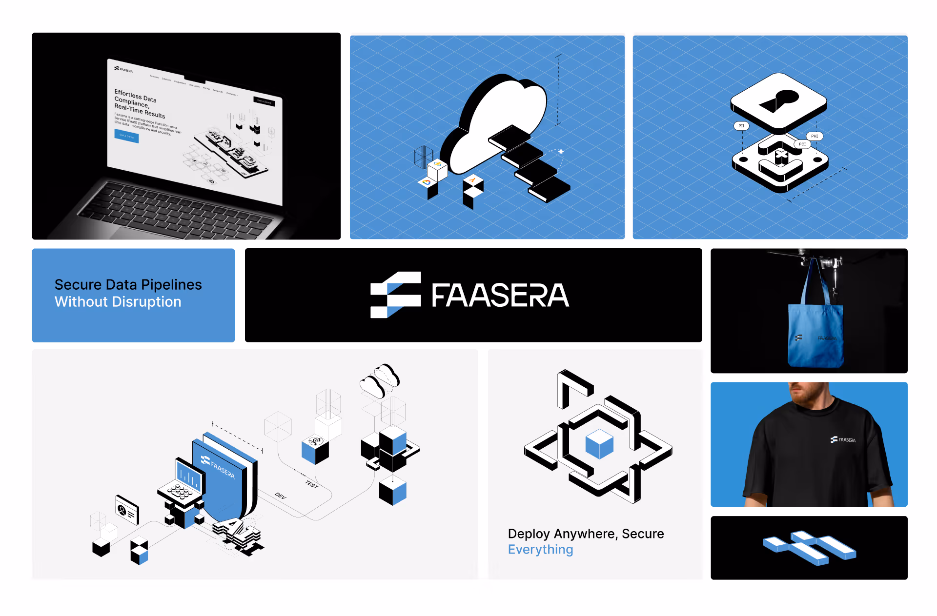
Visual Identity
Logo
Primary logo and variations
Clear space requirements
Minimum size specifications
Color variations (full color, single color, reversed)
Incorrect usage examples
Logo file formats and where to access
Color Palette
Primary colors with values (Hex, RGB, CMYK, Pantone)
Secondary colors with values
Functional colors (UI states)
Color usage guidelines
Accessibility considerations
Color don'ts
Typography
Primary typeface and usage
Secondary typeface (if applicable)
Type hierarchy (headings, body, captions)
Web font specifications
Font licensing information
Type don'ts
Imagery
Photography style direction
Illustration style (if applicable)
Iconography guidelines
Image treatment and filters
Stock photo guidance
Imagery don'ts
Supporting Elements
Grid and layout principles
Spacing system
Graphic elements and patterns
Data visualization style
Verbal Identity
Messaging
Value proposition
Key messages
Elevator pitch versions
Boilerplate descriptions
Tone of Voice
Voice attributes
Do's and don'ts
Example rewrites (before/after)
Tone by context (formal vs. casual situations)
Writing Guidelines
Grammar and punctuation preferences
Capitalization rules
Terminology glossary
Words to use and avoid
Applications
Digital
Website guidelines
Social media templates
Email signature format
Presentation templates
Print
Business card specifications
Letterhead and stationery
Brochure/collateral guidelines
Environmental
Signage guidelines
Office branding
Trade show/event presence
Resources
Asset Library
Logo files download
Font files (or licensing links)
Template files
Stock photo library access
Icon library access
Contacts
Brand owner/guardian
Design team contact
Questions and requests process
Guidelines by Startup Stage
Not every startup needs the same level of documentation. Match guidelines depth to your stage and needs.
Guidelines that don't get used are worthless. Structure for usability, not comprehensiveness.
Principles of Usable Guidelines
Progressive disclosure: Lead with essentials, provide depth for those who need it. Not everyone needs to read everything. Quick-start sections for common tasks, detailed sections for edge cases.
Show, don't tell: Examples communicate faster than rules. For every guideline, show correct usage. Show incorrect usage. Visual demonstration beats verbal explanation.
Make it scannable: Use clear headers, visual hierarchy, and table of contents. People skim for what they need. Help them find it fast.
Provide context: Explain why, not just what. Rules without rationale feel arbitrary. When people understand the reasoning, they make better judgment calls in unlisted situations.
Include don'ts: What not to do is as important as what to do. Common mistakes, incorrect usage examples, and anti-patterns prevent problems before they happen.
Enable action: End sections with what to do next. Where to get assets. Who to contact with questions. How to request exceptions.
Recommended Structure
1. Quick Start (1-2 pages)
For people who need basics fast:
Logo downloads (direct links)
Primary colors (copy-paste values)
Font names (download links)
Contact for questions
2. Brand Overview (2-5 pages)
For understanding context:
Who we are
Our audience
Our positioning
Our personality
3. Logo (5-10 pages)
Complete logo guidance:
Primary logo
Logo variations
Clear space
Minimum sizes
Incorrect usage
File formats and access
4. Color (3-5 pages)
Color system:
Primary palette with values
Secondary palette
Usage guidelines
Accessibility notes
5. Typography (3-5 pages)
Type system:
Primary typeface
Secondary typeface
Type scale
Usage guidelines
Licensing/access
6. Imagery (3-5 pages)
Visual content guidance:
Photography style
Illustration (if applicable)
Iconography
Do's and don'ts
7. Voice and Tone (5-10 pages)
Verbal identity:
Voice attributes
Tone guidance
Writing principles
Examples and rewrites
8. Applications (varies)
Specific touchpoint guidance:
Digital applications
Print applications
Templates and examples
9. Resources
Everything needed:
Asset downloads
Template links
Contact information
Request process
Navigation and Findability
Clear table of contents: Every page should be accessible from clear navigation.
Search functionality: For digital guidelines, search is essential. People look for specific things.
Cross-references: Link related sections. Logo section links to color section when discussing logo colors.
Index or glossary: For comprehensive guidelines, include searchable index of terms.
Creating Living Documentation
Static guidelines decay. Brands evolve. New applications emerge. Teams change. Guidelines must be living documents that grow with the brand.
Governance Model
Assign ownership: Someone must own the guidelines. Clear responsibility for:
Keeping documentation current
Answering questions
Approving exceptions
Managing access
Define update process: How do changes happen?
Who can propose changes?
Who approves changes?
How are changes communicated?
How often are guidelines reviewed?
Version control: Track what changed when:
Changelog in guidelines
Version numbers (v1.0, v1.1, v2.0)
Date stamps on sections
Update Triggers
Guidelines should be reviewed/updated when:
Visual identity elements change
New applications are created (need documentation)
Teams report confusion or questions
Consistent misuse patterns emerge
Company evolves (new products, markets, audiences)
At minimum, quarterly review
Feedback Channels
Create ways for users to surface issues:
Designated Slack channel for brand questions
Form for feedback and requests
Regular check-ins with frequent users
Post-project retrospectives with agencies
Feedback reveals gaps, confusion, and evolving needs.
Training and Onboarding
Guidelines alone aren't enough. Supplement with:
Brand onboarding: Walk new hires through guidelines. Explain the why, not just the what.
Team-specific training: Marketing team needs different depth than engineering. Tailor training to roles.
Refreshers: When guidelines update significantly, communicate changes actively. Don't assume people will notice.
Office hours: Periodic time for anyone to ask brand questions. Surfaces issues, builds relationships.
Brand Guidelines Template
Use this template as a starting point. Customize for your brand.
Logo files: [Link to folder]Primary color: [#HEXCODE]Font: [Font name] — [Download/license link]Questions? Contact [name] at [email]
1. Brand Overview
Who We Are
[2-3 sentences describing the company — what you do, for whom, why it matters]
Our Audience
[Description of target audience — who they are, what they need, what they care about]
Our Positioning
For [target customer]Who [need or opportunity],[Brand] is a [category]That [key benefit].Unlike [alternatives],[Brand] [key differentiation].
Our Personality
We are:
[Attribute 1] — [One sentence explaining what this means in practice]
[Attribute 2] — [One sentence explaining what this means in practice]
[Attribute 3] — [One sentence explaining what this means in practice]
Our Values
[Value 1]: [Brief description]
[Value 2]: [Brief description]
[Value 3]: [Brief description]
2. Logo
Primary Logo
[Image of primary logo]
Our primary logo should be used in most applications. It consists of [description — wordmark, symbol, combination].
Download: [Link to logo files]
Logo Variations
[Images of variations: horizontal, stacked, symbol only, wordmark only]
VariationUse WhenPrimary (horizontal)Default for most applicationsStackedWhen horizontal space is limitedSymbol onlyWhen brand recognition is established (app icon, favicon)Wordmark onlyWhen a lighter presence is appropriate
Clear Space
[Image showing clear space around logo]
Maintain minimum clear space equal to [X] around the logo. No other elements should intrude on this space.
Minimum Size
[Image showing minimum sizes]
Digital: Minimum width of [X]px
Print: Minimum width of [X]mm
Below these sizes, legibility suffers.
Logo Colors
[Images of logo in different color configurations]
BackgroundLogo VersionWhite/light backgroundsFull color or [primary color]Dark backgroundsWhite (reversed)Colored backgroundsWhite or single-color, ensuring contrast
Incorrect Usage
[Grid of incorrect usage examples with X marks]
Do not:
Stretch or distort the logo
Change logo colors
Add effects (shadows, gradients, outlines)
Place on busy backgrounds without contrast
Recreate or modify the logo
Use outdated logo versions
Logo Files
Available formats:
SVG (for web and scalable use)
PNG (transparent background, multiple sizes)
PDF (for print)
EPS (for print and vector editing)
Download: [Link to organized folder with all files]
Be clear: Use simple words. Short sentences. No jargon.
Be helpful: Focus on what users can do, not what they can't.
Be human: Write like a person, not a corporation.
Be concise: Respect people's time. Edit ruthlessly.
Be specific: Concrete beats abstract. Numbers beat vague claims.
Do's and Don'ts
Do:
Use contractions (we're, you'll, it's)
Write in second person (you, your)
Start with the most important information
Use active voice
Explain technical concepts simply
Don't:
Use jargon (leverage, synergy, utilize)
Use superlatives without proof (best, leading, revolutionary)
Use exclamation points excessively
Write walls of text
Be condescending or overly formal
Example Rewrites
Before (generic corporate):"Our innovative solution leverages cutting-edge technology to deliver best-in-class results."
After (our voice):"We help you get better results. Here's how."
Before (too technical):"Configure the API endpoint to enable data synchronization across your infrastructure."
After (our voice):"Connect your tools so your data stays in sync. Here's the setup guide."
7. Applications
Website
[Screenshots or mockups]
Homepage follows [specific layout]
Use type hierarchy as specified
Primary CTA uses [button style]
Images follow photography guidelines
Social Media
[Profile image and cover specifications]
Profile image: Logo symbol, [X]px, centered on [color] backgroundCover images: [Dimensions] per platform
[Example posts showing approved style]
Presentations
[Screenshot of template]
Template: [Link to Google Slides/PowerPoint template]
Use template as starting point
Follow typography guidelines
Maintain adequate margins
Don't overcrowd slides
Email Signatures
[Name]
[Title]

[Company Name]
[email] | [phone]
[website]
Signature generator: [Link if applicable]
Business Cards
[Image of business card design]
Specifications:
Size: [X" x X"]
Paper: [Stock recommendation]
Print vendor: [Recommended vendor]
Order: Contact [person] or use [link]
8. Resources
Asset Downloads
Logo files (all formats)[Link] Color palette (ASE, CLR)[Link] Font files / licensing[Link]Icon library[Link] Presentation template[Link] Social media templates[Link] Email signature[Link]
"Don't do X" without explanation feels arbitrary. People ignore arbitrary rules.
Fix: Explain why. Context helps people make good decisions in situations the guidelines don't cover.
Mistake 7: Over-Engineering Early
Seed-stage startups don't need 100-page guidelines. They need a folder with logo files and a one-page summary.
Fix: Match guidelines depth to stage. Start minimal, expand as needed. Don't create documentation debt.
Brand Guidelines Checklist
Before publishing guidelines, verify:
Content
☐ Brand overview provides strategic context ☐ Logo section covers all variations and rules ☐ Color palette includes all values and formats ☐ Typography section specifies fonts and hierarchy ☐ Imagery direction is clear with examples ☐ Voice and tone are documented with examples ☐ Key applications are covered ☐ Asset downloads are accessible
Usability
☐ Quick-start section for common needs exists ☐ Navigation is clear and scannable ☐ Search functionality works (for digital) ☐ Examples demonstrate rules visually ☐ Don'ts are shown, not just do's ☐ Contact information is prominent
Maintenance
☐ Ownership is assigned ☐ Update process is defined ☐ Version control is in place ☐ Feedback mechanism exists ☐ Review schedule is set
Distribution
☐ Guidelines are discoverable to all who need them ☐ Access permissions are appropriate ☐ Training/onboarding includes guidelines overview ☐ External partners have appropriate access
Summary: Guidelines Enable Consistency
Brand guidelines are the bridge between strategy and execution. They ensure everyone — today's team and tomorrow's hires, internal employees and external partners — executes your brand correctly.
Good guidelines are:
Comprehensive enough to answer common questions
Simple enough to actually get used
Visual enough to show, not just tell
Current enough to reflect actual brand
Accessible enough to find when needed
Invest in documentation proportional to your stage. Start simple, expand as you scale. But don't skip it — even basic guidelines prevent the brand fragmentation that costs far more to fix later.
Your brand will be executed thousands of times by dozens of people. Guidelines are how you ensure they all feel like the same brand.
Frequently Asked Questions
How detailed should startup brand guidelines be?
Match guidelines complexity to your stage. Pre-seed/seed: essentials only — logo usage, colors, typography, and basic tone of voice in a simple document (10-15 pages or a Notion page). Series A: complete documentation covering visual identity, messaging framework, and application examples (20-40 pages). Series B+: comprehensive living documentation with detailed specifications, extensive examples, and asset management — often in a dedicated platform like Frontify or Zeroheight. Over-engineering early wastes resources; under-documenting later creates inconsistency.
Where should I host my startup's brand guidelines?
The best format is one people will actually use. For early-stage startups, a shared Notion page or Google Doc works fine — easy to update, easy to access. As you grow, consider dedicated brand management platforms like Frontify, Zeroheight, or Brandfolder that combine guidelines with asset management. Some companies build custom brand sites for maximum control. The key requirements: easy to find, easy to update, includes downloadable assets, and has clear ownership. Guidelines nobody can find are worthless.
How do I get my team to actually follow brand guidelines?
Enforcement fails; enablement works. Make guidelines easy to access and search. Provide templates and pre-built assets so following guidelines is easier than improvising. Explain the "why" behind rules — people follow guidelines they understand. Assign a brand owner who can answer questions quickly. Build brand into onboarding for new hires. Create feedback channels for edge cases. Celebrate great examples of brand execution. Review periodically and address drift before it spreads.
Need Help Creating Guidelines?
If you're developing brand guidelines — or finding that lack of documentation is causing consistency problems — we can help.
Metabrand creates brand guidelines for tech startups, from lightweight documentation for early-stage companies to comprehensive systems for scaling organizations. We build guidelines that actually get used.


