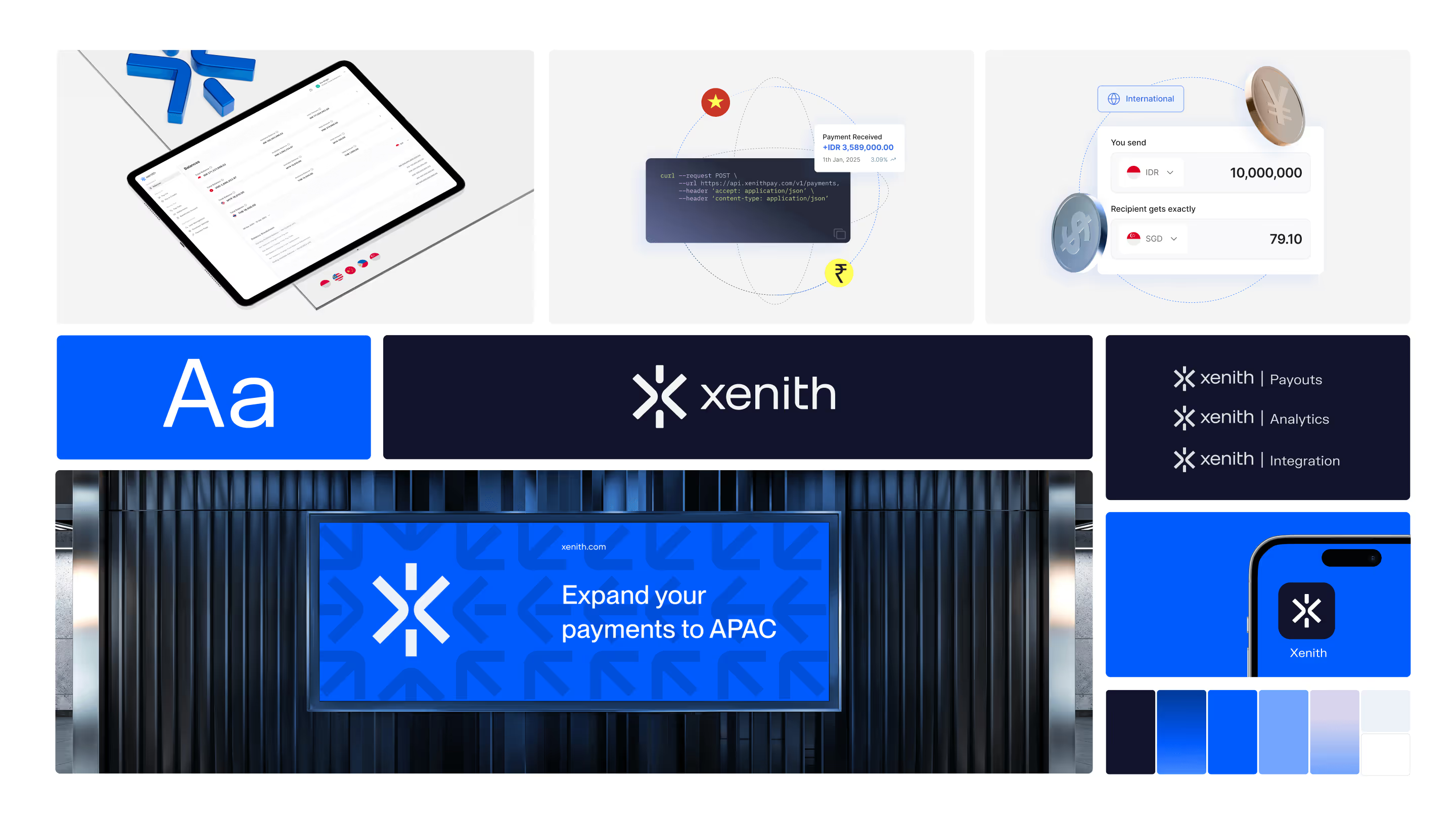
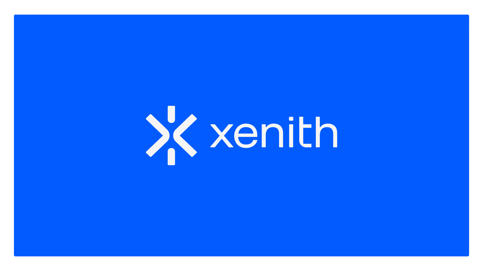
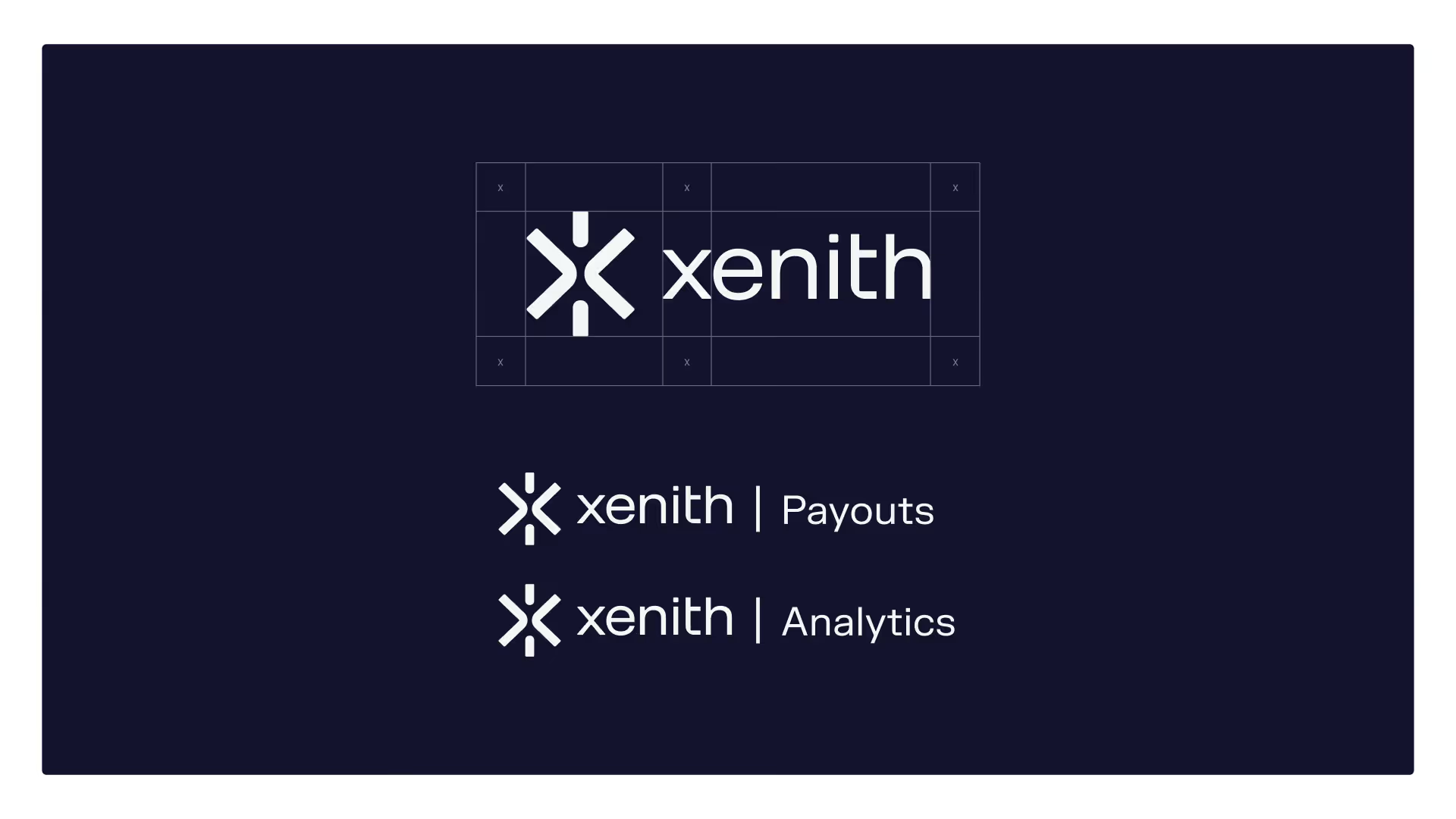
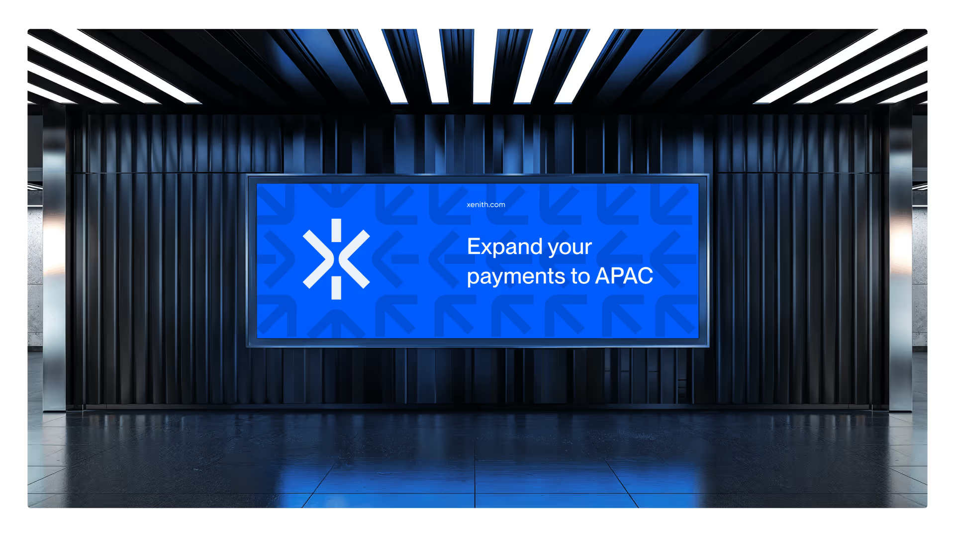
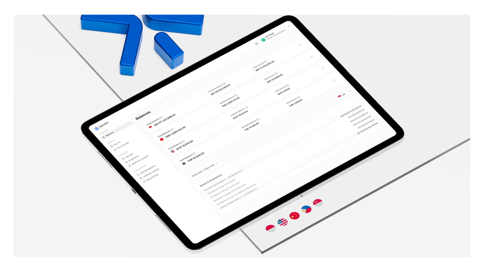
We created a distinctive brand identity for Xenith, tailored specifically for the fintech space. The system combines sharp typography, minimal geometry, and a bold accent color — signaling clarity, trust, and performance in a saturated payment market.
As part of our approach to branding for fintech startups, we developed a logotype, than a system that feels modern, confident, and easy to apply — ensuring Xenith stands apart from legacy providers and overcomplicated design norms.
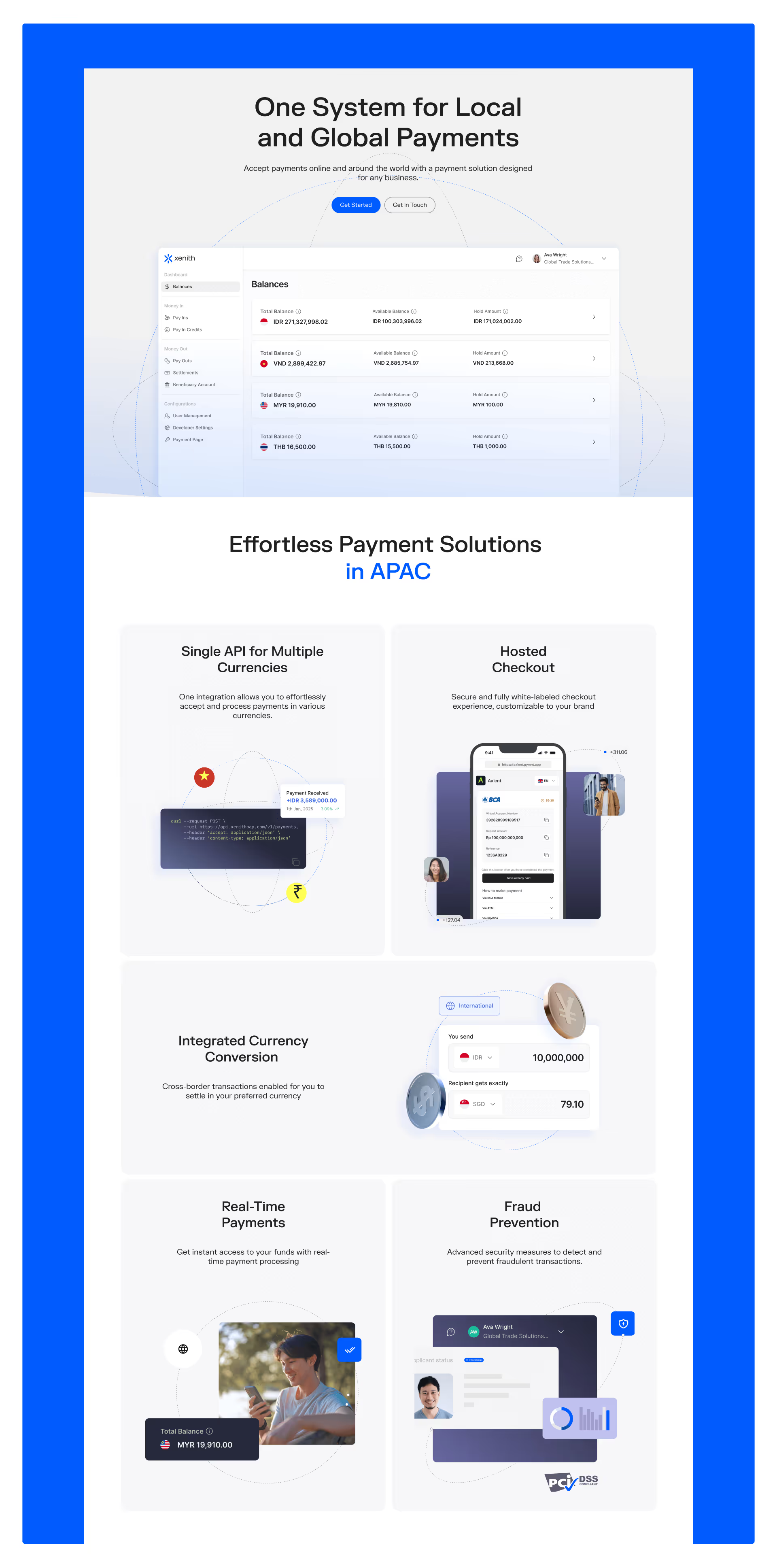
The Xenith website was designed and developed as a seamless extension of the brand. Our goal: to make complex payment infrastructure feel clear and actionable. We used structured layouts, refined messaging, and purposeful animations to tell the story — from APAC coverage to global ambition.
Built in Webflow, the site is fast, responsive, and CMS-powered — a strong foundation for a growing fintech company in need of a digital presence that matches its pace.
At Metabrand, we specialize in branding and website design for fintech startups that need to move fast without sacrificing clarity or credibility. Projects like Xenith require a delicate balance: visual systems that communicate trust, while still feeling modern and competitive.
In the fintech space — especially across APAC — we often see two extremes: over-designed interfaces that overwhelm, or legacy branding that doesn’t scale. Our approach is to build flexible, intuitive design systems from the ground up, with Webflow websites that can grow alongside the company.
Xenith’s project exemplifies our focus: strategy-led brand identities, paired with clear, conversion-friendly UX. Whether you’re launching a new B2B payments platform or rebranding an established fintech product, our goal is always the same — to turn complexity into confidence.