Branding trends emerge, peak, and fade with predictable regularity as designers explore new aesthetic territories and brands seek fresh ways to differentiate. Yet obsessing over trends creates brands that feel current briefly before appearing dated as fashions shift. The challenge for startups is distinguishing genuinely useful developments from superficial stylistic movements, understanding what trends reflect deeper shifts versus temporary aesthetics, and determining when embracing trends serves versus when timeless approaches work better.
Branding trends 2026 reveal several meaningful shifts affecting how brands are built, expressed, and experienced. Some represent genuine evolution in how brands function digitally. Others reflect cultural movements influencing visual preferences. Still others are simply aesthetic cycles where what's old becomes new again. For startups building brands intended to remain effective for years, understanding these distinctions prevents chasing ephemeral trends while missing substantive developments.
This guide examines significant branding developments shaping 2026, distinguishing meaningful shifts from passing fashions, and provides practical guidance helping startups navigate trends strategically rather than reactively adopting whatever appears current without considering whether trends serve their specific contexts and objectives.
Dynamic and Motion-First Brand Systems
The shift toward motion-based brand expression represents genuine evolution rather than superficial trend. As brands exist increasingly in digital contexts where motion is native, static-only brand systems feel incomplete.
Animated logos and brand marks have progressed from novelty to expectation for digitally-native brands. Startups launching today should consider logo animation as integral brand element rather than optional enhancement. Even subtle micro-animations add polish and personality that static marks can't communicate. The question isn't whether to include motion but how extensively based on budget and applications.
Motion design principles integrated into brand guidelines reflect this shift. Forward-thinking brand systems now document animation timing, easing characteristics, transition behaviors, and movement personality alongside traditional color and typography specifications. These motion principles ensure consistent brand expression across animated applications from websites to video content.
Kinetic typography where text moves expressively rather than remaining static enables richer brand personality communication. Headlines that animate on, words that emphasize through motion, and dynamic text layouts create engagement impossible with static type. This trend works particularly well for media brands, entertainment companies, and consumer-facing startups where personality matters significantly.
Interactive and responsive brand elements that adapt to user behavior create engaging experiences while demonstrating technical sophistication. Logos that respond to scrolling, colors that shift based on time of day, or layouts that adapt to user interaction show brands that feel alive and contemporary. However, ensure interactivity serves experience rather than existing purely for novelty.
However, motion shouldn't replace solid static brand foundations. Animated brands must work beautifully when still because many applications remain static. Build strong static identity first, then extend into motion rather than designing primarily for animation assuming static applications will work automatically.
Minimalism Evolving into Expressive Simplicity
The minimalism that dominated branding for years is evolving into more expressive approaches that maintain simplicity while incorporating personality, warmth, and humanity previously sacrificed for pure reduction.
Warm minimalism adds color, texture, and subtle complexity to previously stark aesthetics. Instead of pure white backgrounds and single accent colors, brands embrace richer palettes, subtle gradients, and textural elements creating approachability. This evolution maintains minimalism's clarity while feeling less cold and corporate.
Organic and imperfect elements humanize previously rigid systematic design. Hand-drawn illustrations, organic shapes, authentic photography, and imperfect textures contrast with geometric precision of peak minimalism. These organic touches make brands feel more authentic and accessible, particularly valuable for consumer-facing startups where approachability matters.
Playful typography breaks from neutral sans-serif dominance with expressive display faces, varied type treatments, and creative text layouts. While body copy remains readable, headlines and accent text embrace personality through distinctive typefaces and creative typographic compositions. This typographic expressiveness differentiates brands in categories where everyone adopted similar minimal aesthetics.
However, simplicity's core value—clarity and focus—remains important particularly for startups explaining complex value propositions. Don't abandon clarity for complexity masquerading as personality. The evolution is toward expressive simplicity, not abandonment of simplicity entirely. Maintain focus while incorporating warmth.
Authentic and Purpose-Driven Brand Expression
Consumers increasingly demand authenticity and purpose from brands beyond functional benefits. This cultural shift affects how startups should approach brand building in 2025.
Values-forward positioning makes brand values and purpose central to identity rather than afterthoughts. Successful startups articulate clear perspectives on industry problems, social issues, or changes they're creating. This purpose-driven positioning creates emotional connection beyond product features. However, ensure values are authentic and reflected in actual operations rather than performative marketing claims contradicted by behavior.
Transparent communication about challenges, learning, and evolution builds trust through honesty rather than manufactured perfection. Startups sharing their journey authentically, acknowledging mistakes openly, and communicating transparently about business realities create stronger connections than polished corporate facades. This trend toward radical transparency works particularly well for direct-to-consumer brands and community-focused startups.
Sustainability and social impact integration into brand identity reflects consumer expectations that companies contribute positively beyond profit. Brands should communicate environmental commitments, social initiatives, and responsible business practices authentically. However, avoid greenwashing or impact-washing through superficial claims. Authentic commitment communicated modestly beats exaggerated claims about minimal efforts.
Founder personality integration leveraging authentic founder stories and perspectives creates connection and differentiation. Personal brand and company brand blur productively when founder authenticity drives brand personality. This works especially well for startups where founder credibility and vision significantly influence brand perception.
However, purpose-driven branding requires authentic commitment extending beyond marketing. Consumers detect and punish inauthenticity harshly. Only embrace purpose-driven positioning if you're genuinely committed to delivering on brand promises through operations, not just communications.
Nostalgia and Retro Aesthetics with Modern Execution
Cyclical aesthetic trends bring 90s and early 2000s design sensibilities back into contemporary branding, but with refined modern execution and contemporary technical capabilities.
Y2K aesthetics including chrome effects, digital-inspired gradients, futuristic typography, and tech-optimistic visual language appeal to audiences experiencing these styles fresh or nostalgically. Technology brands, consumer apps, and entertainment companies embrace these aesthetics creating distinctiveness from minimal corporate styles. However, ensure retro references feel intentional and contemporary rather than dated or derivative.
Vintage photography and analog textures provide warmth and authenticity contrasting with sterile digital perfection. Grainy photography, film-inspired color treatments, and analog imperfections humanize brands making them feel crafted and authentic. This works particularly well for lifestyle brands, food and beverage companies, and brands targeting audiences valuing craftsmanship.
Retro typography and lettering using typefaces and lettering styles from previous decades creates nostalgic appeal while standing out from contemporary sans-serif ubiquity. However, ensure vintage typography remains readable and professional. Novelty shouldn't undermine clarity.
Modern refinement distinguishes contemporary nostalgia from pure throwback aesthetics. Today's retro-inspired brands combine period aesthetics with contemporary technical execution, refined composition, and strategic purpose. They reference past styles without abandoning modern sensibilities or functionality.
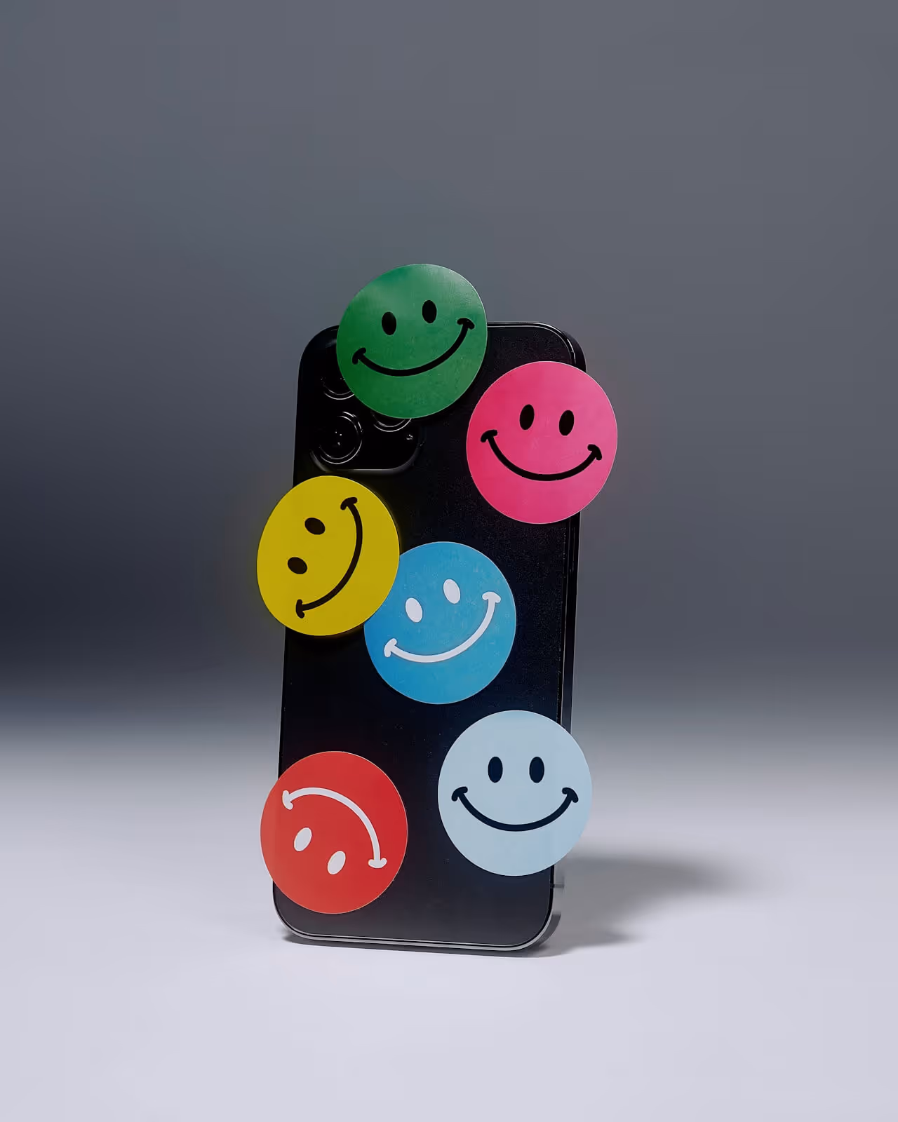
Bold Color and Gradient Renaissance
After years of restrained color palettes, bold saturated colors and complex gradients are experiencing renaissance as brands seek visual impact and differentiation.
Vibrant saturated colors create eye-catching brand presence in crowded digital environments. Neon accents, vivid primaries, and highly saturated palettes differentiate brands from muted competitors while signaling energy and confidence. Technology startups, consumer brands, and entertainment companies particularly embrace bold color creating immediate visual impact.
Complex gradients using multiple color stops and sophisticated blends enable rich visual expressions impossible with flat color. Modern gradients are subtle and sophisticated rather than garish 90s versions. Mesh gradients, multi-directional fades, and textured color transitions create depth and visual interest. However, ensure gradients enhance rather than overwhelm, maintaining brand sophistication.
Duotone and color overlay treatments applied to photography create distinctive visual signatures while maintaining cost-effective production. Single photography stock augmented with brand-specific color treatments becomes unique brand asset. This technique enables distinctive imagery without custom photography budgets.
However, color boldness should serve brand personality appropriately. Not every brand benefits from vibrant neon palettes. Financial services, healthcare, and professional B2B brands might find restrained sophisticated color more appropriate than maximum saturation. Match color intensity to brand positioning rather than blindly following trends.
AI-Enhanced and Generative Design Elements
Artificial intelligence tools are influencing branding workflows and aesthetic possibilities in ways that will accelerate through 2025.
AI-assisted design exploration enables rapid iteration and concept generation helping designers explore more territory faster. AI tools don't replace human creativity but augment it, suggesting directions and variations designers refine. Startups benefit from efficiency gains allowing more exploration within constrained budgets and timelines.
Generative patterns and unique visual systems created through algorithmic processes enable distinctive brand expressions difficult to replicate. These mathematically-derived patterns create ownable visual signatures. However, ensure generative elements feel intentional and controlled rather than random or overwhelming.
Custom illustration and imagery generation through AI tools democratizes custom visual content previously requiring expensive illustration or photography. While AI-generated content shouldn't replace all custom work, it enables startups to create unique visual assets affordably. However, be thoughtful about AI content authenticity and ensure output feels intentional.
Personalization and dynamic content using AI to adapt brand expressions for different contexts, audiences, or individual users creates relevant experiences at scale. However, maintain recognizable brand consistency even as content personalizes. Balance relevance with recognition.
Ethical considerations around AI use in branding require thoughtfulness about disclosure, artist attribution, and avoiding AI replacing human creativity entirely. Use AI as tool enhancing human design rather than replacement eliminating human judgment and craft.
Accessibility and Inclusive Design as Standard
Accessibility is transitioning from compliance obligation to design standard as brands recognize inclusive design serves everyone better while expanding addressable audiences.
WCAG compliance integration ensuring color contrast, readable typography, and accessible interaction patterns becomes standard rather than optional. Startups should build accessibility into brand systems from inception rather than retrofitting later. This prevents exclusionary design requiring expensive remediation.
Readable typography prioritizing legibility over pure aesthetics acknowledges that beautiful but unreadable type fails fundamental communication purpose. Adequate size, appropriate line spacing, clear letter forms, and sufficient contrast enable everyone to engage with brand content effectively.
Colorblind-safe palettes ensure brand colors work for people with various color vision deficiencies. Professional brand systems test color combinations ensuring essential information doesn't rely purely on color differentiation. This consideration expands effective brand reach.
Plain language and clear communication in brand messaging makes content accessible to broader audiences including non-native speakers, people with cognitive differences, or those with limited subject knowledge. Clarity serves everyone while enabling broader reach.
However, accessible design needn't compromise aesthetic ambition. Beautiful sophisticated brands can also be fully accessible. Accessibility constraints often improve design by enforcing discipline creating clearer more purposeful work.
Strategic Timelessness Over Trend-Chasing
Perhaps the most important insight about branding trends 2026 is knowing when to embrace them versus when timeless approaches serve startups better.
Core brand foundations including positioning, personality, and values should remain stable regardless of aesthetic trends. While visual expression might evolve, strategic brand identity should endure. Build brands on strategic fundamentals transcending temporary stylistic movements.
Classic design principles including proper hierarchy, appropriate typography, balanced composition, and strategic color use remain more important than trendy effects. Master fundamentals before incorporating trends. Solid foundation enables selective trend adoption without fundamental weakening.
Category conventions and audience expectations sometimes argue against trend adoption. If your category is conservative and audiences expect traditional professionalism, following cutting-edge design trends might undermine credibility. Assess whether trends serve your specific context.
Long-term brand equity considers how trends age over time. Will this aesthetic feel dated in two years? Some trends have staying power. Others quickly appear obviously tied to specific moment. For startups building brands intended to compound value over years, prioritize approaches aging gracefully.
Selective trend adoption of specific elements serving brand objectives works better than wholesale trend-following. Perhaps embrace bold color but maintain classic typography. Incorporate motion but keep compositions restrained. Strategic selectivity creates contemporary relevance without pure trendiness.
Budget allocation toward trend versus timeless elements should prioritize investment in enduring foundations over trendy flourishes. Spend budget on strong strategic positioning, quality core visual identity, and systematic brand foundations. Then incorporate affordable trend elements adding freshness.
Practical Recommendations for Startups
Specific guidance helps startups navigate branding trends strategically rather than reactively following whatever appears current.
Understand your specific context before adopting trends. What works for consumer entertainment brands differs from B2B SaaS companies. Technology startups can embrace trends that would undermine professional service firms. Match trend adoption to actual audience expectations and category norms.
Prioritize motion and digital-native thinking if building technology products or digital-first brands. The shift toward motion-based brand systems represents genuine evolution worth embracing for digitally-native businesses. Budget for basic logo animation and website motion as standard rather than optional.
Balance personality with clarity ensuring expressive brand choices don't undermine clear value communication. Startups must explain what they do and why it matters clearly. Personality matters but not at expense of comprehension. Maintain clarity as foundation, add personality strategically.
Invest in strong fundamentals before chasing trends. Ensure solid brand strategy, quality core identity, and systematic foundations before incorporating trendy flourishes. Strong basics enable selective trend adoption. Weak foundations make trend adoption destabilizing rather than enhancing.
Work with agencies understanding trends contextually like Metabrand that combine trend awareness with strategic judgment about what serves specific clients. Good branding partners help navigate trends appropriately rather than applying trends formulaically regardless of context.
The most important insight about branding trends 2026 is that trends should inform rather than dictate brand development. Understanding current movements, selectively adopting elements serving your specific objectives, and maintaining strong strategic foundations creates brands that feel contemporary without being trendy, relevant without being derivative, and distinctive without being dated. Build for the long term while remaining contemporary through strategic selective trend adoption.
Want to build a powerful startup brand? Get a free quote from Metabrand.